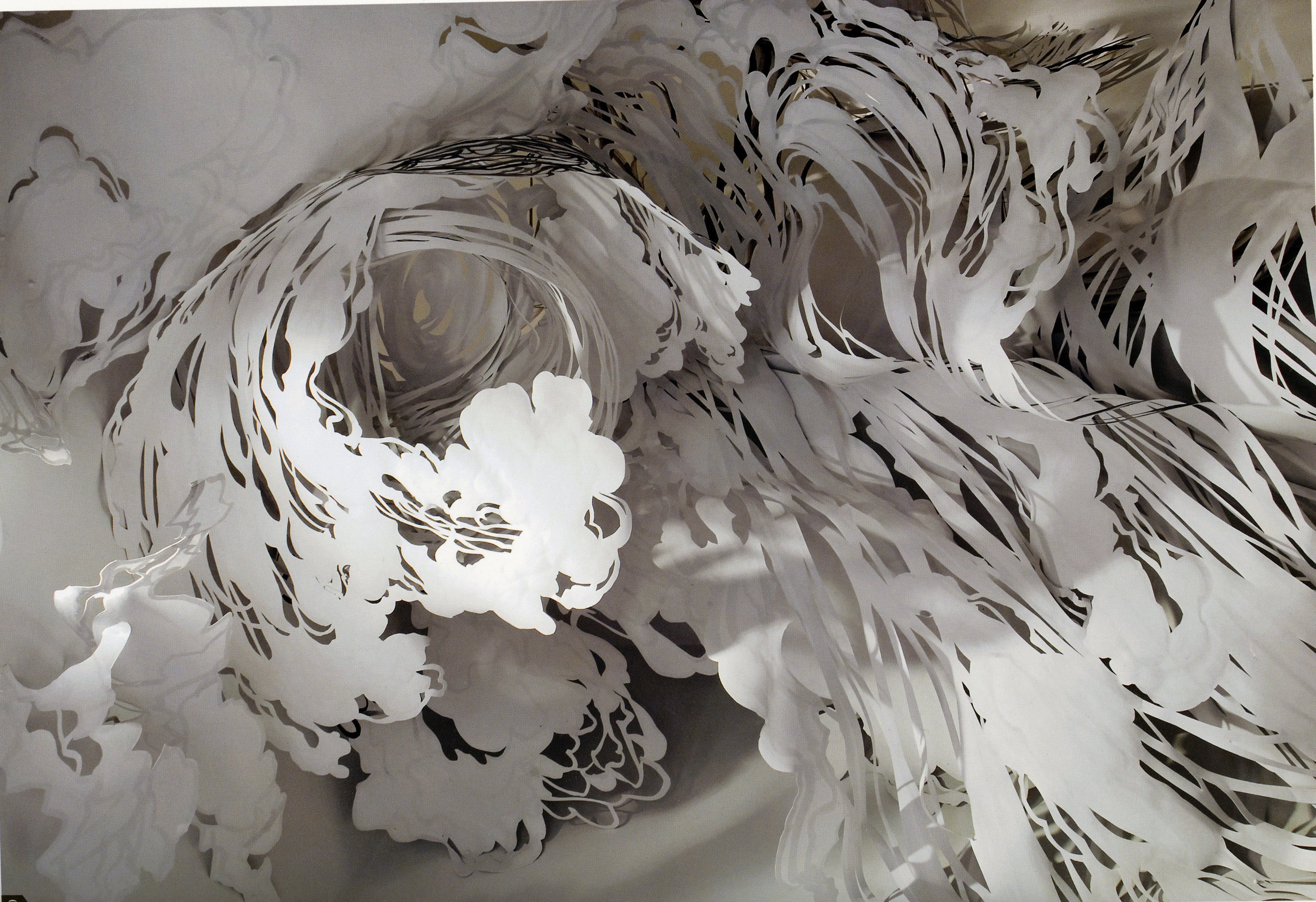
By researching into Mia Pearlman and her paper cuts I was inspired to have a go at this in a typography style. I was unsure how to do this because all of her artwork is 3d and they cover large spaces. So, I used her techniques of drawing the directions within the outline of the typography and then cutting them out so that it flowed and followed a pattern, but in a more simplistic way.


I like the outcome of these because the cuts are noticeable and bold, yet they don’t overpower the type. I had a go at two different styles on both of the letters, using Pearlman’s techniques in each to see which one would work best. The first one was solely paper cuts running in a style that emphasised the curves of the letter R. In the second image I have attempted to used her contrast of black and white the way that she draws some of the cuts onto the paper to juxtapose them against each other in order to make it seem more dramatic. Although, in this instance I feel that it doesn’t work as well because they look slightly random. Maybe this could work better in a 3D form along with different backgrounds.


These are the same paper cutouts but photographed on different backgrounds. Instead of using white on white I used a striped background so that it would contrast the cuts and hopefully create more of a shadow. I prefer this outcome as the outline of the individual letters make them easier to read, which I feel improves the overall appearance and aesthetic.